Overall, I thoroughly enjoyed working on this project and it’s something I look forward to continuing to work on. If you’d like to check out my project as it currently stands, please note that due to the nature of the project, it contains content that is racist, sexist, ableist, homophobic, transphobic, and offensive in numerous other ways. I have censored the figures for this blog post, but my actual project notebook and README are not censored. You’ve been warned, and now you can find my project here.
My goal was to build a classifier to correctly label tweets as either “Hate Speech”, “Offensive Language”, or “Neither”. Originally my plan was to test out an initial classifier or two like random forests or multinomial naive Bayes, then move on to trying neural networks. I didn’t end up getting around to the deep learning part yet because I ultimately became very interested in comparing the performance of multiple classifiers and really digging into the implications of the top-performing model. This post will focus on what I learned so far, as well as a function I wrote and found particularly helpful for plotting model coefficients.
Consider the types of model best suited to your specific problem
I tend to learn and remember things best from experience, so I like to test out and compare various types of models when approaching a new type problem. If you regularly work with a specific type of problem, you’ll probably have a model type of choice that you’ll automatically gravitate towards. As a new data scientist myself, my advice to new and aspiring data scientists is to get curious and test things out. You might be surprised that something performs well and there are always opportunities to learn more about your data and various modeling techniques by simply trying things out. If you’re concerned about runtime, consider subsetting your data to get an idea of how things work and decide if you want to proceed.
Since this was my first experience diving into a natural language processing (NLP) task, I wanted to test out various options for processing and modeling the data. I tried two vectorizers (Scikit-Learn’s CountVectorizer and TfidfVectorizer) and did not see a major change in model performance. The most interesting changes came from testing out different types of classifiers on the same data. After doing some research into which algorithms are commonly used to tackle NLP and specifically text classification tasks, I chose to test a random forest classifier, multinomial naive Bayes, LinearSVC, and XGBoost. I tried each first with the default parameters, and while nearly all the fit models made predictions for the test data with over 80% accuracy, LinearSVC and random forest emerged as the top performers for flagging hate speech as hate speech, without sacrificing much when it came to accurately predicting the other two categories.
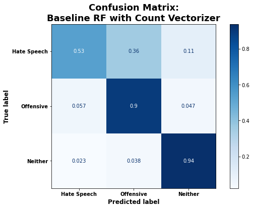
Of the default models, the random forest classifier had the highest accuracy of 86% on the test data, and the second highest recall for the hate speech category (53%). It classified the other two categories (offensive and neither) with very high accuracy (90% and 94%, respectively). From the confusion matrix below, it’s clear that the model most often misclassified hate speech as merely offensive language. This isn’t surprising given that there is bound to be overlap in the use of language common to both categories.

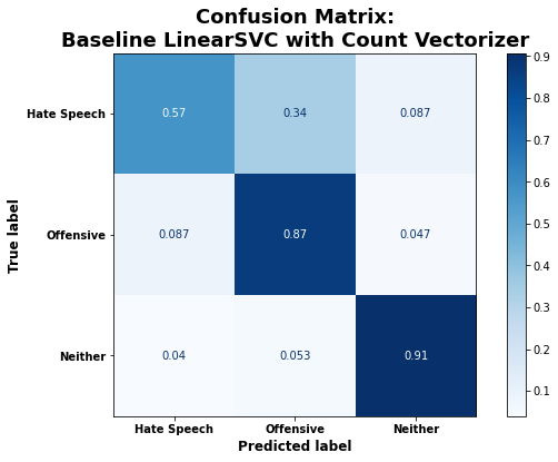
The default LinearSVC model had the second highest overall accuracy on the test data: 84%. It also had the highest recall for the hate speech category of all default models, classifying those tweets correctly 57% of the time.

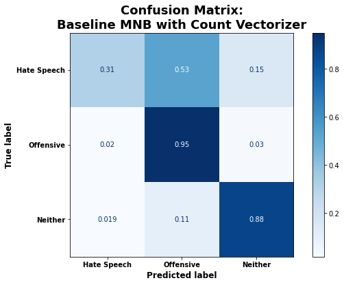
Both the multinomial naive Bayes and XGBoost classifiers trained with default parameters had an overall accuracy of 83%, but they performed substantially worse when it came to correctly classifying hate speech. As shown below, the default multinomial naive Bayes (MNB) model was actually more likely to classify hate speech as offensive language than as hate speech.

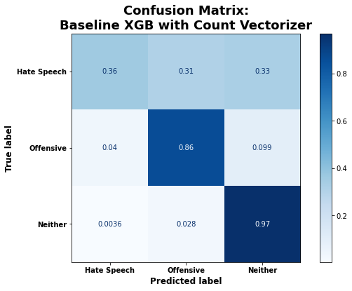
And when presented with a hate speech tweet, the XGBoost classifier performed so poorly that it seemed to be randomly assigning those tweets to one of the three categories:

I am uncertain why the multinomial naive Bayes and XGBoost classifiers performed so poorly for this specific task. I was able to improve them somewhat by tuning hyperparameters. However, as I have observed when comparing models on other tasks, the best models trained with default parameters remained the best models after I had tuned the hyperparameters for each model type.
Interpreting Models
Looking back now, it makes a lot of sense that the random forest classifiers and LinearSVC models performed quite well for this task. When classifying hate speech versus offensive language versus neither, your first step would be to look for the presence of offensive or hateful words - for example curse words or slurs. If you don’t see any of those, it’s probably neither. If you do see a curse word or slur, it likely qualifies as hate speech or otherwise offensive so you need to parse a little further. At a very basic level, that is how these two algorithms are operating, though they are quite different. The random forest classifier is essentially asking a series of yes/no questions. “Is this word in the tweet? No? Ok, well what about this word?” Once enough of those questions have been asked and answered, the tweet ends up in a leaf node and you have your prediction/ classification.
When training a LinearSVC model to make predictions for more than two classes, the algorithm fits as many “one-vs-rest” classifiers as you have categories. So in this case, 3 classifiers, one of which asks “How do I best delineate hate speech tweets from the other classes?”, one asking the same about offensive language tweets, and the other about “neither” tweets. Additionally, Linear Support Vector Classification seeks to maximize the space around the support vectors that define the boundaries among the classes in the feature space. Once again, the “neither” class will be most clearly defined by a lack of curse words and slurs, and the main difficulty lies in distinctly separating out merely offensive language from true hate speech. There tends to be more overlap there, so we see the model having more difficulty defining a clear boundary between the two while still performing relatively well overall.
Perhaps one of the most interesting parts of the whole project for me (at least so far) was being able to create visuals that provided insight into how the algorithms were working and what they were relying on most to make predictions. To do this for random forests, you need to work with the feature importances and for a LinearSVC model you need to be able to plot the coefficients. This is somewhat easier said than done, but well worth the effort in my opinion. I just really enjoy seeing how things work, ok?
Ultimately LinearSVC emerged as the top performing model after tuning hyperparameters and I found exploring the coefficients of the LinearSVC model much more informative. I’ll provide the function I wrote to accomplish that task in just a second. However, we first need to take a step back and look at how I built the pipelines to fit my classifiers so the function to plot model coefficients will make more sense.
To fit a LinearSVC model with default parameters, using NLTK’s TweetTokenizer and scikit-learn’s CountVectorizer, I used the following code:
## Build baseline LinearSVC Pipeline with Count Vectorizer

# Initialize tokenizer
tweet_tokenizer = nltk.tokenize.TweetTokenizer(preserve_case=False, reduce_len=True)

# Build Pipeline for fitting model
svc_cv_pipe = Pipeline(steps=[
                         ('count_vec', CountVectorizer(tokenizer=tweet_tokenizer.tokenize,
                            stop_words=stopwords_list)),
                         ('svc', LinearSVC(random_state=319))
                        ])

# Fit baseline LinearSVC with Count Vectorizer
svc_cv_pipe.fit(X_train, y_train)
Thus, the vectorizer step here is named ‘count_vec’ and the classifier step is named ‘svc’. The specific names of these steps are important for being able to access and use the information needed to plot the model coefficients. Also, remember how I said earlier that LinearSVC fits as many classifiers as you have categories? That’s going to be important as well because the sets of coefficients are specific to those classifiers. So you’ll also have as many sets of coefficients to plot as you have categories. Now, having seen that structure and keeping the ideas of named steps and a classifier for each category in mind, let’s look at the function I wrote to plot LinearSVC model coefficients:
def plot_coefficients(clf, clf_step_name, vec_step_name,
                      class_label, model_title='', top_features=10,
                      save=False, fig_name=None):

    """Takes in an sklearn classifier already fit to training data, the name of the step for that model
       in the modeling pipeline, the vectorizer step name, a class label, and optionally a title describing the model.
       Returns a horizontal barplot showing the top 20 most important features by coefficient weight (10 most
       positive and 10 most negative).

    Args:
        clf (estimator): An sklearn Pipeline with a vectorizer step and final step is a fitted classifier.
        clf_step_name (str): The name given to the classifier step of the pipe.
        vec_step_name (str): The name given to the vectorizer step of the pipe.
        class_label (int): Integer representing numerically encoded class of interest (found in the
				        classes_ attribute of the fitted classifier).
        model_title (str): A description of the model for customizing plot title.
        top_features (int, default=10): Number of top positive and top negative coefficients to plot
            (so default of 10 returns bar plot with 20 bars total).
        save (bool, default=False): Whether to save the returned figure.
        fig_name (str, optional): What to name the file if the image is being saved.

    Returns:
        figure: Matplotlib.pyplot bar plot figure showing the coefficient weights for the top
            20 most important features.

    Example:
        >>> plot_coefficients(clf=my_model, clf_step_name='clf', vec_step_name='vec',
                                 class_label=0, model_title='My Model', top_features=10,
                                 save=True, fig_name='my_model_coeffs')

    """

    import pandas as pd
    import numpy as np
    import matplotlib.pyplot as plt


    fig_filepath = 'Figures/'

    ## Get the coefficients for the specified class label
    feature_coefs = (
        clf.named_steps[clf_step_name].coef_[class_label])

    ## Get the vocabulary from the fit vectorizer
    feature_names = (
        clf.named_steps[vec_step_name].vocabulary_)

    # Create a version of the vocab dict with keys and values swapped
    vocab_swap = (
        {value:key for key, value in feature_names.items()})


    ## Store the top 10 positive coefficients and their indices
    pos_10_index = (
        np.argsort(clf.named_steps[clf_step_name].coef_[class_label])[-top_features:])
    pos_10_coefs = (
        np.sort(clf.named_steps[clf_step_name].coef_[class_label])[-top_features:])

    ## Store the top 10 negative coefficients and their indices
    neg_10_index = (
        np.argsort(clf.named_steps[clf_step_name].coef_[class_label])[:top_features])
    neg_10_coefs = (
        np.sort(clf.named_steps[clf_step_name].coef_[class_label])[:top_features])

    ## Combine top positive and negative into one list for indices and one for coefs
    top_20_index = list(pos_10_index) + list(neg_10_index)
    top_20_coefs = list(pos_10_coefs) + list(neg_10_coefs)


    ## Get list of top predictive words and use it as index for series of coef values
    top_words = []

    for i in top_20_index:
        top_words.append(vocab_swap[i])

    top_20 = pd.Series(top_20_coefs, index=top_words)


    ## Create plot
    plt.figure(figsize=(8,6))

    # Color code positive coefs blue and negative red
    colors = ['blue' if c < 0 else 'red' for c in top_20]

    # Adjust title according to specified class code
    class_dict = {0: 'Hate Speech', 1: 'Offensive Language', 2: 'Neither'}
    title_class = class_dict[class_label]

    fig = top_20.sort_values().plot(kind='barh', color=colors)
    fig.set_title('Top Words for Predicting {} - {}'.format(title_class, model_title),
                  fontsize=18, fontweight='bold')
    plt.xticks(fontsize=12, fontweight='bold')
    plt.yticks(fontsize=12)

    if save:
        plt.savefig(fig_filepath+fig_name+'_'+title_class.replace(' ', '_'), bbox_inches = "tight")

    plt.show()

    return fig
It took a good while to figure out, but doing so definitely helped my understanding of what sort of information is stored in a fitted classifier, how it’s stored, and how to access it. If you do adapt a version of this function for your own project or purposes, I definitely recommend testing this piece by piece to be sure it’s plotting what you think it’s plotting. It should be easy to adapt the class_dict according to your own model classes (again, double check you’ve got the correct order by checking the .classes_ attribute). Additionally, you should be able to adapt this function for any similar NLP task where you’re using a classifier that stores coefficients (as opposed to feature importances - this will not work as desired for feature importances).
Using this plot_coefficients function, I am able to plot the top 10 positive and top 10 negative coefficients that influence how my best tuned LinearSVC model predicts whether or not a tweet should be labeled as hate speech (class label of 0):
plot_coefficients(clf = best_svc, clf_step_name = 'svc', vec_step_name = 'count_vec', class_label = 0,
                     top_features = 10, model_title =  '\nBest Model on Non-Lemmatized Data')

The blue bars represent the top 10 positive coefficients and the red bars represent the top 10 negative coefficients when it comes to classifying hate speech. All those censored words corresponding to the blue bars are slurs (either referring to race or sexual orientation). From the size of the blue bars compared to the red, it’s clear this classifier can be thought of more as predicting “for” hate speech, rather than “against” it. The negative coefficients don’t have nearly as much weight and for the most part those words seem fairly random. So in a sense, of the three classifiers fit by this single best LinearSVC model, the hate speech one is relying heavily on the presence of slurs to make a prediction/ classification of hate speech.
Next up, offensive language, which had a class label of 1:
plot_coefficients(clf = best_svc, clf_step_name = 'svc', vec_step_name = 'count_vec', class_label = 1,
                     top_features = 10, model_title =  '\nBest Model on Non-Lemmatized Data')

Again we see that the blue bars are for the most part substantially bigger than the red bars. This shows that the offensive language classifier can also be thought of as predicting “for” the category, rather than “against” it. The longest blue bars, corresponding to the most heavily weighted positive predictors of merely offensive language are all words that are derogative of women or femininity.
Finally, let’s take a look at how the “neither” category classifier within the best LinearSVC model worked (class label of 2):
plot_coefficients(clf = best_svc, clf_step_name = 'svc', vec_step_name = 'count_vec', class_label = 2,
                     top_features = 10, model_title =  '\nBest Model on Non-Lemmatized Data')

Here we see something much different than for the other two classifiers. The red bars, representing the most negative coefficients are substantially longer than the blue bars. This classifier is essentially ruling out or predicting “against” hate speech and offensive language rather than predicting “for” neither. All the words corresponding to the red bars are either slurs, curse words, or words that a majority of people find offensive. The blue bars, which carry much less weight, correspond to words that all seem fairly random. These would likely change depending on the random sample of tweets for which you’re making predictions.
Equipped with the ability to make these types of visuals, it’s much easier to see how your classifier is doing what it’s doing and to explain how it works to someone else!