Bar Plots
Bar plots (also known as bar graphs or bar charts) are some of the most commonly used methods of visually representing data. They are extremely useful for displaying categorical data, or numerical data that is easily and intuitively binned into a handful of groups. Let’s go ahead and look at an example that I’ll continue to work with throughout the rest of this post. The graph below is a bar plot, created with Python’s Seaborn library. It plots house price along the y-axis (vertical) against house grade (a measure of the relative condition and quality of the home) on the horizontal x-axis. Note that you can also create horizontal bar graphs, and all you would need to do would be to switch the axes.
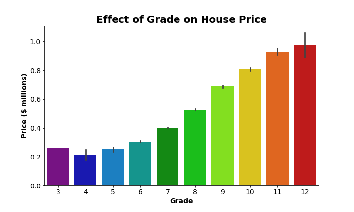
For any bar graph, the length or height of each bar represents the relative amount of each category. So here we have 10 bars, one for each grade 3 through 12. It’s very easy to see that house price increases with increasing grade. In other words, the bars get taller (higher price) as we move to the right and grade increases. Bar graphs such as this are best used when you want to provide a visual comparison of the central tendencies, usually of the mean (as in the above graph), among different groups.
Making a Bar Plot with Seaborn
Python’s Seaborn library is a great resource for creating data visualizations. Anytime you want to use a Seaborn function, make sure you’ve imported the required libraries:
## import necessary libraries
import matplotlib.pyplot as plt
%matplotlib inline # magic command needed for Jupyter notebooks
import seaborn as sns
To create the example graph, I used Seaborn’s built in barplot() function as part of the following code:
## make a bar plot showing the effect of grade on price
## set the dimensions of the figure
plt.figure(figsize=(10,6))

## this creates the actual figure on a Matplotlib Axes object
ax = sns.barplot(x='grade', y='price_mil',
                 data=housing_df,
                 palette='nipy_spectral')

## set and adjust axis labels, ticks, and figure title
ax.set_xlabel('Grade', fontsize=14, weight='bold')
ax.set_ylabel('Price ($ millions)', fontsize=14, weight='bold')
ax.set_xticklabels(list(range(3,13)), fontsize=14)
ax.set_yticklabels(ax.get_yticks().round(1), fontsize=14)
ax.set_title('Effect of Grade on House Price', fontsize=20, weight='bold')

## display the graph
plt.show()

So that’s how we make that graph. Aside from setting the figsize, adjusting the color palette to something I personally find more aesthetically pleasing, and adding and formatting labels and titles, I did not adjust the main defaults for sns.barplot(). Seaborn automatically calculated the mean of each group/ category (all the houses with a certain grade) and used that to set the height of each bar.
Additionally, Seaborn automatically calculates 95% confidence intervals by default, and plots those on each bar. Those bars are essentially showing the range of values we are 95% certain contains the true mean of each group. But what if we wanted a better idea of the dispersion around the mean of each group? For example, the standard deviation? Well, Seaborn allows us to easily adjust the confidence intervals in exactly this way. The code below changes the confidence intervals from the default 95% intervals to show 1 standard deviation above and below the mean. Also, some of the confidence intervals were difficult to discern on the darker bars. We’ll fix that by making the bars slightly transparent by adjusting the alpha value to be less than 1 (opaque) and greater than 0 (essentially invisible):
## make a bar plot showing the effect of grade on price
plt.figure(figsize=(10,6))
ax = sns.barplot(x='grade', y='price_mil',
                 data=housing_df,
                 palette='nipy_spectral',

                 ## make the bars slightly transparent
                 alpha=0.5,

                 ## set confidence intervals to show standard deviation
                 ci='sd')

ax.set_xlabel('Grade', fontsize=14, weight='bold')
ax.set_ylabel('Price ($ millions)', fontsize=14, weight='bold')
ax.set_xticklabels(list(range(3,13)), fontsize=14)
ax.set_yticklabels(ax.get_yticks().round(1), fontsize=14)
ax.set_title('Effect of Grade on House Price', fontsize=20, weight='bold')

plt.show()
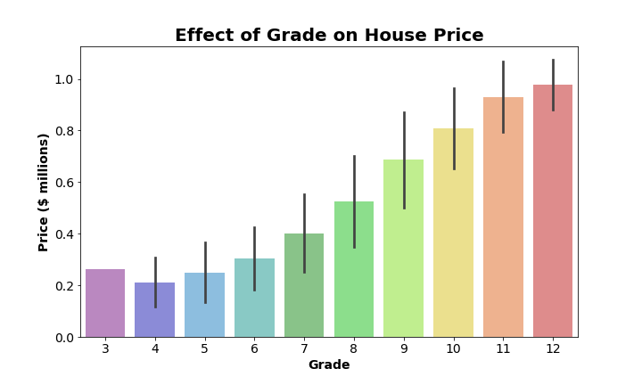
Much better! Now we can see not only the mean price for each group of houses, but also have an idea of how much variation there is around the mean for each group.
Advantages and Drawbacks
The main advantage of bar plots is that, for a reasonable number of categories or groups, we can easily compare groups and identify general trends. Bar graphs are best for helping us understand differences in the averages of each group, but they don’t do a great job of showing how much scatter or variation there is within each group. Confidence intervals help make up for this drawback to a degree, but truly understanding what a confidence interval conveys requires at least a little statistical knowledge (and clear communication about what sort of confidence interval is shown).
Strip Plots
Strip plots are essentially a type of scatter plot. They are used to show the spread of observations within each category. Like a regular scatter plot, you end up with a point for each observation in your dataset. These points are grouped (and color-coded) with other observations that fall into the same category. This helps provide a sense of the density of observations according to each category, and allows for a visual comparison of the range and variation of each category. Below is an example strip plot based on the exact same data that was used to make the bar graphs from earlier:
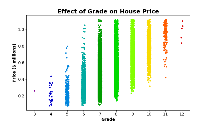
Well, now we can see exactly why the bar graph never showed confidence intervals for grade 3 houses (if you happened to catch that): there’s only one! There’s no standard deviation and no quantifiable uncertainty about the mean of a single observation. Not only do we get a sense of the range and variation of each of the categories by looking at this strip plot, we can also see relative disparities in the size of each group. Grade 3 consists of only one house, and grades 4 and 12 are made up of only a handful of observations. The majority of houses fall into grades 7, 8, and 9. In fact, there are so many observations in grades 7, 8, and 9 that those categories look more like bars than clusters of points. In the next section, we’ll see how we can fix that.
Making a Strip Plot with Seaborn
Seaborn makes creating strip plots just as easy as it was to create those bar plots. Instead of the barplot() function, we need to use sns.stripplot(), but the rest is basically the same. Let’s look at the code that generated the example strip plot:
## make a strip plot showing the effect of grade on price
## set the dimensions of the figure
plt.figure(figsize=(10,6))

## this creates the actual figure on a Matplotlib Axes object
ax = sns.stripplot(x='grade', y='price_mil',
                   data=housing_df,
                   palette='nipy_spectral')

## set and adjust axis labels, ticks, and figure title
ax.set_xlabel('Grade', fontsize=14, weight='bold')
ax.set_ylabel('Price ($ millions)', fontsize=14, weight='bold')
ax.set_xticklabels(list(range(3,13)), fontsize=14)
ax.set_yticklabels(ax.get_yticks().round(1), fontsize=14)
ax.set_title('Effect of Grade on House Price', fontsize=20, weight='bold')

## display the graph
plt.show()

Once again, aside from setting the figsize, adjusting the color palette, and formatting labels and titles, I did not adjust the main defaults for sns.stripplot(). However, as noted before, there are so many observations in grades 7, 8, and 9 that the data points all blur together. We can fix that and make it easier to see how the scatter really is made up of individual observations with the following adjustments to our original block of code:
## make a strip plot showing the effect of grade on price
plt.figure(figsize=(10,6))
ax = sns.stripplot(x='grade', y='price_mil',
                   data=housing_df,
                   palette='nipy_spectral',

                   ## plot each point with an outline and set each to be slightly transparent
                   linewidth=0.5, alpha=0.6)

ax.set_xlabel('Grade', fontsize=14, weight='bold')
ax.set_ylabel('Price ($ millions)', fontsize=14, weight='bold')
ax.set_xticklabels(list(range(3,13)), fontsize=14)
ax.set_yticklabels(ax.get_yticks().round(1), fontsize=14)
ax.set_title('Effect of Grade on House Price', fontsize=20, weight='bold')

plt.show()
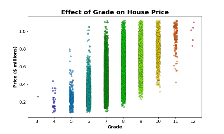
By specifying a linewidth of 0.5 when calling sns.stripplot(), we’ve added a border to each data point. This makes it easier to pick out individual data point within the clouds, especially when alpha is set to a value less than 1 (in this case 0.6), making each point slightly transparent as well.
Advantages and Drawbacks
The main advantage of strip plots is that they allow you to visualize/ compare the range and dispersion of observations within each category with respect to some variable of interest (price in the example we’ve been using). You can see where the majority of observations fall for each category. These are the densest regions. You can also identify possible outliers within each category if you notice a certain observation falls far away from the main cluster of points for its group. As an added bonus, strip plots give you an idea of the number of observations (essentially the sample size) within each group. The main drawback of strip plots is that it can be difficult to determine where the relative center of the distribution of each group is. What is the average or median price of a house in each category? If you had not first seen the bar graph of these data, it would be difficult to gauge with any level of certainty.
Using Bar Plots and Strip Plots in Combination
Now that you’ve seen bar graphs and strip plots, what each can convey clearly, and where they fall short, hopefully you can see a case for using them in conjunction. The strength of the one type of plot complements the weaknesses of the other quite well. Looking at them separately provided different key insights into the data. If only there was some way to look at them both plotted together, rather than separately…
Plotting a Bar and Strip Plot on the Same Axis
Luckily, Seaborn makes this extremely easy. The following code should look very familiar, because all we need to do is paste code we used before together so the two plots show up on the same Matplotlib Axes object. We don’t need to change anything.
## make a bar plot showing the effect of grade on price
plt.figure(figsize=(10,6))
ax = sns.barplot(x='grade', y='price_mil',
                 data=housing_df,
                 palette='nipy_spectral',

                 ## make the bars slightly transparent
                 alpha=0.5)

## plot a strip plot of the same data on top of the bar plot
ax = sns.stripplot(x='grade', y='price_mil',
                   data=housing_df,
                   palette='nipy_spectral',

                   ## plot each point with an outline and set each to be slightly transparent
                   linewidth=0.5, alpha=0.6)

ax.set_xlabel('Grade', fontsize=14, weight='bold')
ax.set_ylabel('Price ($ millions)', fontsize=14, weight='bold')
ax.set_xticklabels(list(range(3,13)), fontsize=14)
ax.set_yticklabels(ax.get_yticks().round(1), fontsize=14)
ax.set_title('Effect of Grade on House Price', fontsize=20, weight='bold')

plt.show()

The above graph is our bar graph plotted underneath our improved strip plot. I adjusted the alpha of the bars (alpha=0.5) to make them slightly transparent. This way all the individual points show up clearly, and the bars still very obviously show the mean for each group. However, now that we can see the dispersion of points on top of the bars, we really don’t need those 95% confidence intervals. Plus I find it distracting that you can only see confidence intervals for one of the bars (maybe two if you look really, really closely). We can drop those from the figure by setting ci=None. And while we’re making adjustments, let’s plot a nice horizontal line to show the mean house price across all the groups:
## make a bar plot showing the effect of grade on price
plt.figure(figsize=(10,6))
ax = sns.barplot(x='grade', y='price_mil',
                 data=housing_df,
                 palette='nipy_spectral',

                 ## make the bars slightly transparent
                 alpha=0.5,

                 ## remove confidence intervals
                 ci=None)

## plot a strip plot of the same data on top of the bar plot
ax = sns.stripplot(x='grade', y='price_mil',
                   data=housing_df,
                   palette='nipy_spectral',

                   ## plot each point with an outline and set each to be slightly transparent
                   linewidth=0.5, alpha=0.6)

## plot horizontal line for the mean house price
ax.axhline(y=round(housing_df['price_mil'].mean(), 2), ls=':', c='k', linewidth=3,
           label='Mean Price = ${} million'.format(round(housing_df['price_mil'].mean(), 2)))

ax.set_xlabel('Grade', fontsize=14, weight='bold')
ax.set_ylabel('Price ($ millions)', fontsize=14, weight='bold')
ax.set_xticklabels(list(range(3,13)), fontsize=14)
ax.set_yticklabels(ax.get_yticks().round(1), fontsize=14)
ax.set_title('Effect of Grade on House Price', fontsize=20, weight='bold')

plt.legend(fontsize=14, loc='lower right')

plt.show()
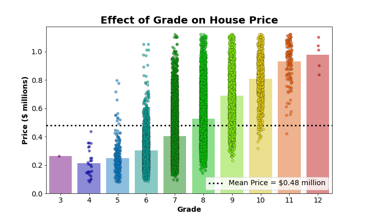
Now, from this single graph, we can easily see:
- the mean of each group (the height of the bar)
- the mean across all groups (the dotted line)
- how each group mean compares to the overall mean (does it fall above or below the line?)
- the range of values present in each group (relative minimum and maximum)
- the degree of dispersion around each group mean (the distribution of strip plot points)
- the relative size of each group (compare the number of points in each group)
It was not possible to glean all this information from a bar or strip plot alone, but combined into this final product, it’s possible to extract all this information with relative ease. And it wasn’t even that painful to set up, thanks to Seaborn!