Outliers are essentially data points that seem like they may not belong with the rest of the data. They are observations that stick out and may cause you to question whether that observation was generated by the same process or mechanism as the rest of the data. If it wasn’t, then it doesn’t rightfully belong in the population represented by the rest of the data.
Some outliers are worth further exploration and others are not. Those that fall into the latter category are generally those that arose due to some random error during measurement or data entry. If there is not enough information to correct the values for these observations, they are better off dropped from the dataset. Sometimes outliers may represent interesting cases that are worth investigating to develop a better understanding of whatever process we want to model. In other words, what makes the outlier so strange, and can we learn anything useful from it?
Unfortunately, outliers tend to cause problems for certain types of machine learning (ML) algorithms. They are especially problematic for linear models, especially those based on ordinary least squares algorithms such as linear regression. Other types of ML models can be fairly robust to outliers, especially tree-based algorithms. So the first question you should probably ask yourself before you start worrying too much about outliers in your dataset is “How does the ML algorithm I want to use handle outliers?”. If the algorithm(s) you plan to work with don’t make strong assumptions about the distribution of variables or the presence of outliers, don’t worry about it too much. However I still recommend looking into the presence of outliers while you explore your data.
The remainder of this post will focus primarily on identifying outliers and being able to extract them from a dataset so they can be removed or adjusted. I will use the King County house sale dataset available here for examples. If you’d like to open up a notebook and follow along, go ahead and save the dataset and execute the following code:
## import necessary libraries
import pandas as pd

import numpy as np

import matplotlib.pyplot as plt
# magic command for Jupyter notebooks only
%matplotlib inline

import seaborn as sns
sns.set_style('darkgrid')

## read in csv file
data = pd.read_csv('kc_house_data.csv')
# your file path may be different depending on where you saved the dataset
Methods for Identifying Outliers
Visualizing Outliers
As part of your exploratory data analysis, it is common to use visualizations such as histograms and boxplots better understand the distribution of the variables. These graphs can be a good first step in identifying which variables may contain extreme observations that are worth a closer look.
For example, the following code will plot a boxplot for the target variable (price), as well as 3 features (bedrooms, condition, and sqft_living):
cols = ['price', 'bedrooms', 'condition', 'sqft_living']

plt.figure(figsize=(10,8))

for idx, col in enumerate(cols):
    ax = plt.subplot(2,2,idx+1)
    sns.boxplot(data[col], ax=ax)
    ax.set_title(col, fontsize=16, fontweight='bold')

plt.tight_layout()
plt.show()
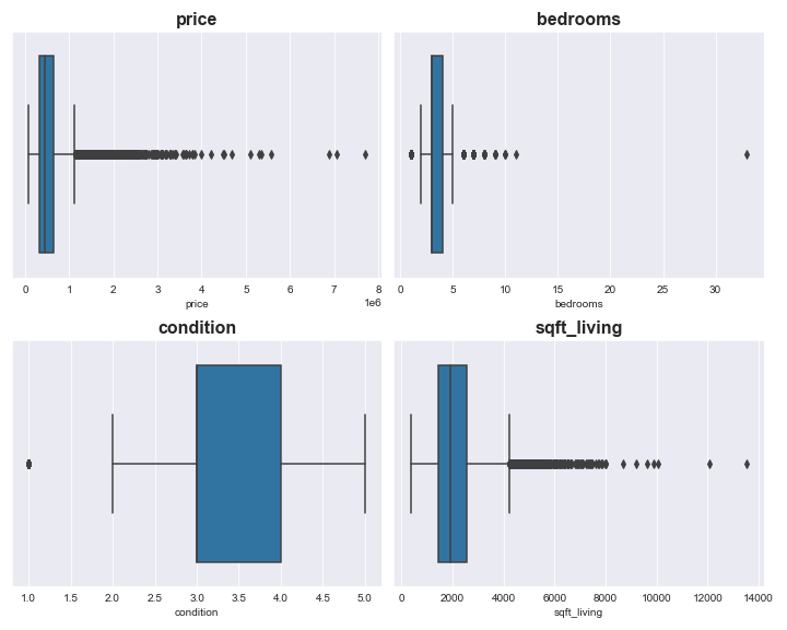
From the above plot we can see that the distribution of both price and sqft_living are skewed and likely contain outliers. There appears to be an extreme outlier in the variable bedrooms. The variable condition appears to have far less extreme values than the other 3 variables.
The code below produces a histogram showing the distribution of the target price:
plt.figure(figsize=(8,6))

# plot the distribution of price
ax = sns.histplot(data['price'], bins='auto', color='b', kde=True)
ax.set_title('Sale Price Distribution', fontsize=16, weight='bold')
ax.set_xlabel('Price', fontsize=14, weight='bold')

# plot and label a dashed line at the maximum value for price
ax.axvline(x=data['price'].max(), color='k', linestyle='--',
            label='Max price:\n$ {} million'.format(data['price'].max() / 1000000))

# plot and label a dashed line at the minimum value for price
ax.axvline(x=data['price'].min(), color='k', linestyle='--',
            label='Min price:\n$ {} million'.format(data['price'].min() / 1000000))

ax.legend(fontsize=14, loc='upper center')
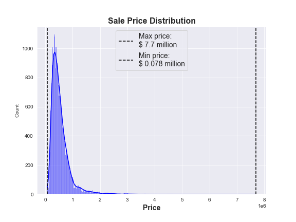
From this plot we can see that the vast majority of houses in the dataset sold for less than $1.5 million, but there is a small number of houses that sold for anywhere between $2 - 8 million. However, it is impossible to tell how many houses fall into that price range from this plot.
This is why I find Seaborn’s jointplot() so useful: you can examine the scatter of individual observations of a variable of interest against the target variable, as well as the distribution of both variables. This allows you to get a better sense of how many outliers there are for each variable and puts it into a useful context (i.e., how the variable is related to the target). The block of code below plots the number of bedrooms against the sale price:
g = sns.jointplot(x='bedrooms', y='price', data=data, kind='reg', height=8);
g.fig.suptitle('Price vs Bedrooms', fontsize=16, weight='bold')
g.set_axis_labels('Bedrooms', 'Price', fontsize=14, weight='bold')
g.ax_marg_x.set_xlim(0, 35);
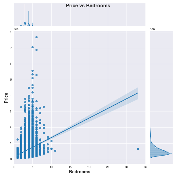
Based on the above plot we can clearly see a single outlying observation of a house that is listed as having more than 30 bedrooms! We can also better see the distribution of individual houses that sold for more than $2 million and these look more and more like outliers the closer we get to the top left corner of the graph. For now, let’s find that house with over 30 bedrooms and check it out:
# slice out a dataframe including the id, price, bedrooms, and sqft_living
# for any house with more than 30 bedrooms
data.loc[data['bedrooms']>30][['id', 'price','bedrooms','sqft_living']]

There’s our single outlying house. It says it has 33 bedrooms, but the square footage of the interior of the house is only 1,620 sq ft. That doesn’t make much sense. At this point, we could simply choose to drop this erroneous record, or we could try to fix it if we really cared. Since we know the index, we can just drop the record like this:
data.drop(index=15856, inplace=True).
But let’s investigate a little further. We can look at the median sqft_living for houses grouped by number of bedrooms as follows: data.groupby('bedrooms').median()[['sqft_living']]
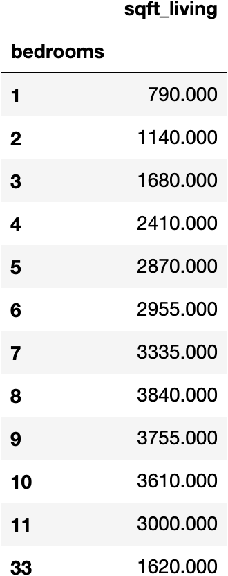
It appears that houses with only 3 bedrooms are most similar to our 33 bedroom house in terms of interior living space. And with data.describe()['bedrooms'] we can see that the median number of bedrooms is 3 and the mean is close to 3. Thus it seems reasonable to replace 33 with 3 bedrooms. That can be accomplished with the following block of code, which will then also replot the jointplot once that observation has been adjusted:
data.loc[data['bedrooms']==33, 'bedrooms'] = 3

g = sns.jointplot(x='bedrooms', y='price', data=data, kind='reg', height=8)
g.fig.suptitle('Price vs Bedrooms', fontsize=16, weight='bold')
g.set_axis_labels('Bedrooms', 'Price', fontsize=14, weight='bold')
g.ax_marg_x.set_xlim(0, 12);
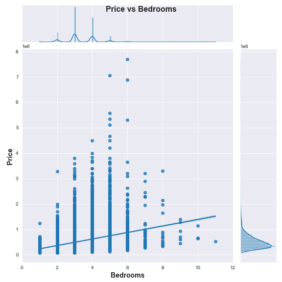
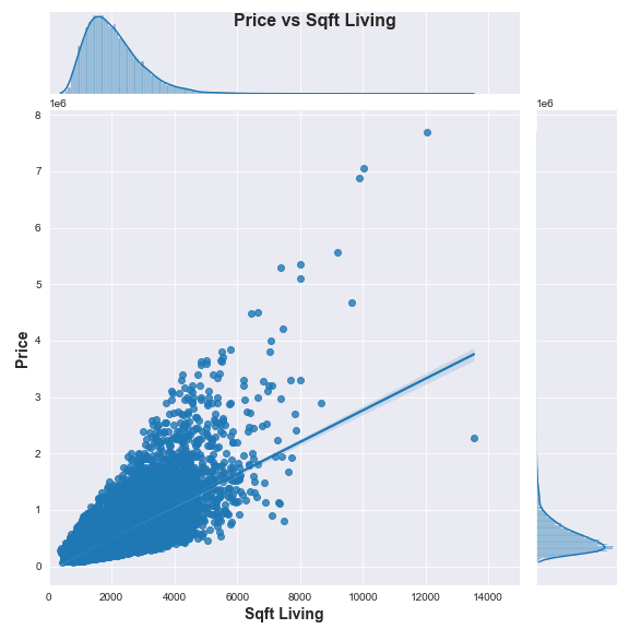
You can adjust the code yourself to check out the distribution and scatter of other variables like condition and sqft_living against the target price. If you do, you may agree with me that condition doesn’t seem to have outliers that are cause for concern, but sqft_living may potentially present a problem (shown below).
Defining Outliers Mathematically
Once you’ve visually determined which variables have outliers that you may need to deal with, you need a way of explicitly quantifying and defining those observations as outliers. There are a few methods for doing this, two of the most common are based on z-scores and on the interquartile range (IQR). The z-score method essentially defines outliers for a specific variable as any observation with a value more than 3 standard deviations above or below the mean. The following function will return the index of outliers according to the z-score method for a single variable:
# first import additional necessary library
from scipy import stats

def z_outliers(variable, cutoff=3 , verbose=True):

    """Takes in a variable as a series/ dataframe column and calculates the absolute value of the
       z-score for each observation. Returns a series with the same index as the data with True
       if the observation is an outlier (defined as having a z-score of 3 standard deviations (default)
       from the mean) or False if the observation is not an outlier."""

    z_scores = np.abs(stats.zscore(variable))
    z_scores = pd.Series(z_scores, index=variable.index)
    idx_outliers = z_scores > cutoff

    if verbose:
        print('Z-score method found {} outliers.'.format(idx_outliers.sum()))

    return idx_outliers
The IQR method of outlier removal is more strict in terms of what is considered an outlier than the z-score method, meaning it will classify a greater number of observations as outliers. To use this method, you first determine the lower quartile (0.25) and the upper quartile (0.75). The IQR is then defined as the upper quartile value minus the lower quartile value. A threshold is then set at 1.5 times the IQR. Values above or below the threshold are considered outliers. The following function returns the index of outliers according to the IQR method for a single variable:
def IQR_outliers(variable, verbose=True):

    """Takes in a variable as a series/ dataframe column and calculates the IQR and threshold for the variable.
       Returns a series with the same index as the data with True if the observation is an outlier
       (defined as falling above or below the threshold) or False if the observation is not an outlier."""

    upper_q = variable.quantile(q=0.75)
    lower_q = variable.quantile(q=0.25)
    IQR = upper_q - lower_q
    thresh = 1.5*IQR

    idx_outliers = (variable < lower_q-thresh) | (variable > upper_q+thresh)

    if verbose:
        print('IQR method found {} outliers.'.format(idx_outliers.sum()))

    return idx_outliers
If we wanted to use these functions to find outliers for the target price and then create new datasets where these outliers have been dropped, the following code does the trick:
## create a series that denotes outliers outliers based on z-scores
# (True if outlier, False if not)
price_z_outliers = z_outliers(data['price'])
# create a dataset that drops all z-score outliers
data_z = data[~price_z_outliers]

## create a series that denotes outliers outliers based on IQR
# (True if outlier, False if not)
price_IQR_outliers = IQR_outliers(data['price'])
# create a dataset that drops all IQR outliers
data_IQR = data[~price_IQR_outliers]
And we can modify the code for our original plot of the distribution of price to get an idea of how dropping outliers based on the 2 methods changed the distribution of the target.

As expected, the IQR method truncated the range of price values more than the z-score method because it removed more observations (1,158 observations via IQR compared to just 406 based on z-scores). If you choose to remove outliers, you will definitely want to be aware of how this ultimately affects the scope of the model you build. For example, a model trained on the IQR dataset can really only be expected to accurately predict prices for houses within the range of $78,000 to $1.12 million. Whether or not this is acceptable will depend on the problem you are trying to address.
Options for Dealing with Outliers
Once you have identified that there are outliers within your dataset, you have options for how to deal with them. You can choose to remove outliers from the dataset. You could do this across all variables or only consider a subset of variables for which to remove outliers. Alternatively, you could choose to discretize or bin certain variables. This would automatically group outliers into the lowest or highest bin, along with other less extreme values. You might even consider capping outlier values at a set minimum or maximum value for each variable. These methods could also be used in combination based on your judgment and domain knowledge.
If you choose to remove outliers, even just for one variable, realize that this may change the distribution of other variables as well. Additionally, if you bin or cap outliers for certain variables, be aware this may distort the relationship of those variables with others in the dataset.
Outliers don’t always need to be removed. They can sometimes be safely ignored or even learned from. Experiment with how different approaches affect model performance. And be sure to document the choices you make and how they influence the scope and performance of your ML algorithm.